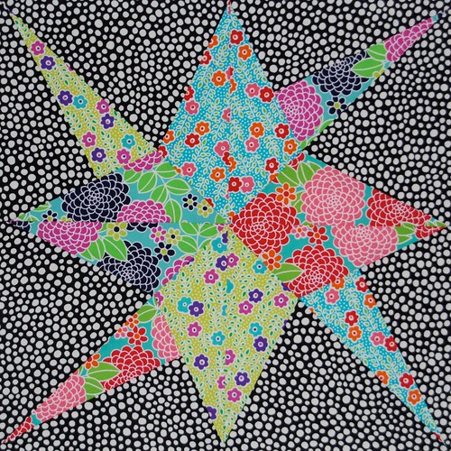
I love each fabric individually. I love the block (
from Sheila at bluepatchquilter's Mystery QAL). But all together this is not working for me. Is it because I've put together too many prints of similar scale prints and similar values? There's no contrast and the pattern doesn't pop in the way I'd like it to. Well, on the positive side, I'm trying my hardest to be brave with colour and pattern. As
Dan (Piece and Press) told me: "Lynne, quilting isn't for wimps". Possibly my favourite ever quilting quote.

You've given me a migraine!!!
ReplyDeleteIt is a bit wild for me, however, I was thinking (without knowing how large the piece is) you could do a large decorative stitch in one or more bright colors around the inner pieces to make it pop off the page. Happy quilting!
ReplyDeletethink it could have just done with a strip if white all round the .. star. Gone cross eyed now...
ReplyDeleteI think you're right- it's because the fabrics are of the same colour value -three of the four centre pieces have aqua as their background colour and two have red and pink as their flowers. I love the block pattern though!
ReplyDeleteI think if you went for a less busy background then this would help matters already. True, the colour values of the star are similar but I think there is enough contrast there. The background distracts from it though.
ReplyDeleteYou're right, it doesn't have much contrast, but if this is one block in a quilt of similar blocks it could add interest because of its low contrast. If you're making more blocks, just make sure most of them have more contrast (value in particular), especially in the background. It has a lot of potential!
ReplyDeleteYou win some and you lose some.....and I just happened to have my sun glasses on as your post popped up.....I'm sitting in the sun reading the blogs on my fancy ipad. Seriously, I hate when that happens....but you usually hit it right on.
ReplyDeleteDid you ever see those pictures that you have to stare at really close and slowly move them away from your face and then an image appears? That is what this reminds me of... and hurts lol. Way to be brave tho!
ReplyDeleteYeah, I think you're right about similarity in value. I really like the way the triangles intersect, giving it a layered effect, but it took me a minute to see that. I think I like the blue and yellow with small flowers; pairing them with similar scale but different main colors would be pretty. A black-on-black print would make a nice (safe!) background.
ReplyDeletethanks for showing us what didn't work and exploring the reasons why. One of my favorite quilt quotes is "there are no mistakes, only design opportunities" and if that doesn't fit the bill there's always a back up quote of "if you can't see it from 10 feet away on a galloping horse don't worry about it!"
It's different and you are right, it does strain my eyes! Thanks for sharing though.
ReplyDeletehttp://KoolBeenz-blog.blogspot.com
It reminds me of those pictures you stare at until your eyes water trying to see the 3D dinosaurs or something. Ha ha.
ReplyDeleteI do like the block though, I'd like to try it sometime.
If the black and white fabric had been more black or more white, say all black with tiny pin dots, it would have read more as a solid, and the star would have stood out. I imagine the similar values in the star would have been okay then. I love black and white with brights, and it's always a challenge to pick just the right one. Live and learn! I'd say you've taken a giant leap into color. Good for you!
ReplyDeleteI think it is the busy0ness of the background. I was imagining how it would look with a solid, even a bright one (such as a magenta or orange) and I think the star block would hold together and pop against the background.
ReplyDeleteHooray for you for stretching out of your comfort zone, though. And for reminding us that even when things don't turn out perfectly, it's still worth the effort. (Sometimes, reading quilt blogs might lead one to believe that some people never take a faltering step...and perhaps they don't...but it's heartening to see that even quilting heroes sometimes wind up with something they don't adore.)
I actually love the background. Where the flow (for me anyway) stops is because I think you may have placed the flow through of the same colour shards differently. So my eye is expecting to see a flow through from one part to the next and it doesn't happen. I think if you get the flow of the fabrics right, the background will be fine. I'm not sure if that makes sense but there you go!
ReplyDeleteYou get an A+ for courage! I tend to quilt on the safe side so I admire your risks.
ReplyDeleteIts the spots! There's teeny little dots on the bright prints (the leaves) and then loads of dots on the background... or are my eyes just seeing spots?! Its a fab block though, just go round the star with a little black 1/4" fusable bias, that'll fix it!
ReplyDeleteLove the quote- awesome.
ReplyDeleteIt kind of reminds me of those pictures that were popular a while back, where if you looked at it with your eyes unfocused, it turned into a 3-d picture? I think I like it....
ReplyDeleteWow! I have to say that is a big much. I think it is because all the prints are the same scale and all the colors are the same value. That is one wild block!!
ReplyDeletei love it. i love all of it.
ReplyDeleteStay strong!
ReplyDeleteI agree with piecemealquilts that the subtlety of the value contrast could be wonderful in a larger composition.
It's cool in a psycho migraine-inducing kinda way. Without anywhere for your eyes to take a breather, you just go round and round searching for a rest until your head is about to blow off. Bet you never thought your work would have so much power, hunh?
ReplyDeleteI love this block but I think the dots are killing it! Well done for experimenting - nothing ventured nothing gained! Your next one will be perfect and now we know you are no wimp! heehee but I might just be...
ReplyDeleteMy first thought was of the pictures used for testing colour blindness as a kid! For me it's the background that's fighting with the lovely coloured prints. Perhaps a change of background might make all the difference. Jxo
ReplyDeleteI agree with Judith, it's like a colour blindness test. Maybe you could put a number in for us to look for? Part of the reason it doesn't work (she said knowledgeably) is that the black and white dots chomp into the black and white flowers so you lose the shape. My remedy? Go and have a drink.
ReplyDeleteI love all your bright star fabrics, I just don't think the black and white is working (that's the bit that makes my eyes go funny), what about rying it with a solid background? Also what about mixing up the fabric in the kite shapes - so that a kite is made of 2 different fabric halves (hope that makes sense!).
ReplyDeletethat made my eyes ache... would rather see a solid background instead of the black & white, as it would be alot less busy
ReplyDeleteI like it, even though it looks like one of those images used to test people for color blindness.
ReplyDelete