
So I'm starting the Ruby Star Rising quilt I'm making for my sister's friend and have just done a few trial blocks to get started. The idea for the quilt is to look like one of those walls in a kind of artsy Woody Allen New York apartment which is covered in pictures of all shapes and sizes. So I've made a few "pictures" and am auditioning them against a few of the solids I've bought for the quilt: ash, candy green, coral, amber, dusty peach and cyan. Should I go with one of these or something else? When the quilt is made, the pictures will be closer together so the background bits will be thinner.
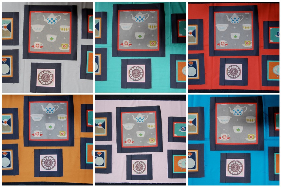
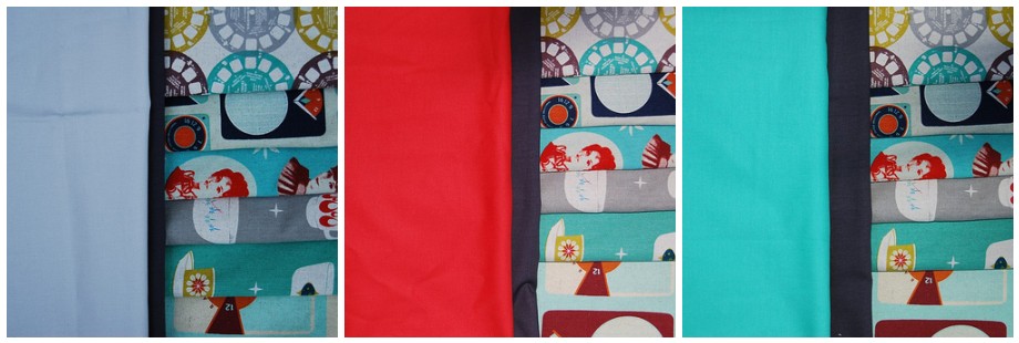
Still choosing but, after discussed with my sister's friend, we are narrowed down to ash, candy green and coral and here they are pictured with the charcoal and the full array of the fabrics.
I really love it - what a great idea and really effective. I love them all actually but my favourite is...the amber...or the red? Go with the solids!
ReplyDeleteI'm loving the coral, amber and cyan the best
ReplyDeleteThey look great! I like the top row and the amber personally. The colors all work really well with ruby star rising!
ReplyDeleteI REALLY like the amber
ReplyDeleteI think the coral or amber are best - just worried about the patch with the coral background it sort of disappears when the whole background is coral, so I'm being pulled more to the lighter amber colour. I do like the cyan but it just doesn't work with your larger block as the colour isn't in it in any quantity.
ReplyDeleteI like the candy green and the cyan the best. It makes the colors in the Ruby Star Rising fabrics stand out and not seem so dull. That's a really cute idea for a quilt!
ReplyDeleteI thought I was going to be odd when I picked my fave, but it looks like we are all thinking the same thing. I love it on the Amber. It works so well because the yellow orange is a contrasting color to the all the turquoise in the print. My second vote would be the candy green because it still contrasts really well with the "pictures". I'm totally against any of the neutrals because you loose all the charm of the prints and they just fade away into the background. They greys would look great with one of the RSR prints in aqua.
ReplyDeleteOkay...you did ask. I'm just full of opinions! lol
I keep going back & forth on what my favorite is, but it's not the ash or the peach. I definitely like the brighter colors-all of them!
ReplyDeleteCandy green is my top choice. Great contrast and it just looks more "artsy" to me.
ReplyDeleteMy vote is for the Amber! I think it really sets off the blocks well. But the brighter colors for sure, rather than the more pastel.
ReplyDeleteFor me the candy green makes the fabric pop. It could be that lovely inner border on that lower rh corner block with the orange background that pulls it together, but that is my choice. Of course, it is not like seeing it in person. I am sure any of these will be fabulous!
ReplyDeleteI like the candy green and cyan best!
ReplyDeleteI like the candy green or the amber best, but I'm more drawn towards the amber because it really makes the pictures stand out!
ReplyDeleteI was drawn first to the coral or candy green but I'm pretty sure the coral pops way too much, lol, and I think the candy green might be a bit much. Have you got more aqua RSR prints to include?
ReplyDeleteAnyway, I think the amber really hits the spot and it could almost BE a retro painted wall! Perhaps I take things a little too literally.
Oh, and I need one of these too :)
I like the candy green and amber! Can't wait to see this quilt finished, it's going to look great.
ReplyDeleteI love the top middle and top right. They really make the RSR pop.
ReplyDeleteI suppose it depends on if your sister's friend has any particular likes/dislikes colour-wise. But the amber definitely does it for me
ReplyDeleteBottom right but that's because I'm a blue girl.
ReplyDeleteWhich ever you choose it will be beautiful.
I like all of them together!
ReplyDeleteBut if pushed I would say the cyan, its alot fresher and will go with so much more than other colours, I guess it depends on your friends taste?
I say all of them... why just go with one? woohoo!
ReplyDeleteI really like the top left and the bottom middle, then you could do a stronger solid or print border with the red or blues, or binding. Any way you choose, they all look great!
ReplyDeleteLove this style of quilt. My least fav. backgrounds are the ash & peach. Most fav. are the coral and turquoise. Jxo
ReplyDeleteVery cool!!! I love the mustardy color...is that cyan? It pulls that color out of the print and makes the frame pop. Great design lynne!!!
ReplyDeleteThis is going to be so fun!!! What colour does the recipient like? Does your sister know the colour of the bedroom or lounge where the quilt is going? That would be a help. If her entire house is white, then I'd pick the middle top row colour (aqua-ish?).
ReplyDeleteAsh! But... I always like grey with everything.
ReplyDeleteI like the coral and the candy green the best, they pick up the colours in the other fabrics so well.
ReplyDeleteDefinitely the green/aqua, end of...
ReplyDeleteHmmm - I think I'm in the minority here (lovely blocks btw!1) but I think the coral (that's the tomato soup-y one top row, right?) really does the whole artsy Manhattan apartment wall thing brilliantly!
ReplyDeleteIt shows off the fabrics just right - I think they then stand out like little framed pictures ... the amber is nice too but it makes the 'frames' recede into it a bit too much for me ... The ruby is strong so it can take it!
(IMHO!!)
Candy green FTW!!
ReplyDeleteI got my fabric today for my hexagon park quilt! So excited!!!
What an original idea!! You're just full of cool inspirations. I'm in awe .... again.
ReplyDeleteCandy green
ReplyDeletecoral, coral, CORAL!!!!!
ReplyDeleteLSWH
Wow you are super fast! I am so excited to see this quilt finished! Candy green is definitely my favorite :)
ReplyDeleteLooks like I'm not alone in choosing Amber! Of the three in the runner-up category, I think coral works the best.
ReplyDeleteThis quilt is going to be stunning.
Ash or coral would be what I'd be going with! Great blocks!
ReplyDeleteI'm loving the candy green and coral!
ReplyDeleteI like the green or the blue! What a wonderful idea...actually at first I thought you were using all the solids, which I also thought were pretty awesome, lol!
ReplyDeleteMy favourites the candy green or the coral. Looks fabulous though, look forward to seeing the end result :)
ReplyDeleteCandy Green! What else did you expect from me? ... LOL It's going to be fab!
ReplyDeleteOhh Coral is nice esp with the coal. very dramatic
ReplyDeleteI like the ash and the coral but the coral is my fav
ReplyDeleteI wouldn't normally go red but I love the prints against the coral .
ReplyDeleteIt will make a big statement .
Coral or Amber. The dark bordered blocks recede into the Ash colour, it is too dull and the blocks look lost.
ReplyDeleteI think the Warm colours looks the most exciting
I like the ash and I LOVE the coral! I picked those two before I even knew you had narrowed down the field!
ReplyDeleteI love the coral or the candy green, I think the ash, as much as I love grey, looks too washed out.
ReplyDeleteCoral or candy green. I also liked the amber.
ReplyDeleteI think that your choices are great but I would probably substitute amber for the coral, I love amber.
ReplyDeleteCandy green gets my vote - your "pictures" look great!
ReplyDeleteLove the amber or the candy green. Also love how it looks so far. :D
ReplyDeleteI'd go for the candy green, can't wait to see it finished.
ReplyDeletei really like the aqua in the top row...it is pretty fun and bright
ReplyDeleteI am big fan of Ruby Star and love what your are doing with it. Still have lots of the fabric in my stash that is dying to be made into a bag and a quilt.
ReplyDelete