
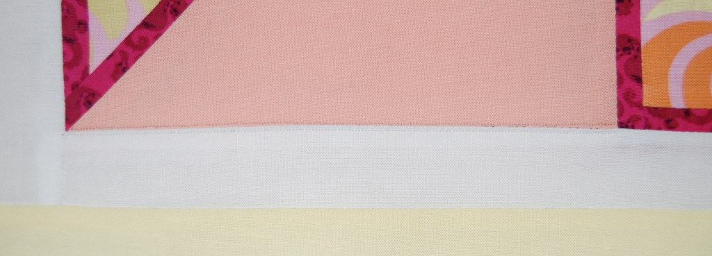
Well with only two days to go until my Moda Bake Shop debut and Sherbet Pips layer cake giveaway (which I have in fairness only mentioned about eleventy six times), I need something to pass the time and what better than a little tutorial on how to reinforce a dangerously scant seam. Oooh and before I do that, how about a sneak peek at the Moda Bake Shop quilt - here it is all rolled up sitting patiently on the windowsill for its glorious moment in the spotlight. And yes, as well as being my debut on Moda Bake Shop (have I mentioned that?), it will also be Sherbet Pips' debut on Moda Bake Shop. It's a double whammy.

Here's how I fix a scant seam or two (as I had a couple of horribly scant seams on the triple framed pinwheel I made in this post). Cut a strip of fusible interfacing about 1/2" wide and the length of your scant seam. Iron it so it sits right on top of the seam on the wrong side.

Now flip to the right side and sew a run of tiny stitches (I set my machine to "1" length) along the edge of the seam - about a thread or two away from the seam on each side in threads as close to the colours of the fabrics as possible. These lines of stitches are almost invisible partly because they are the same colour as the fabric and partly because they are so small. And VOILA, your dodgy scant seam is reinforced.
Here's how I fix a scant seam or two (as I had a couple of horribly scant seams on the triple framed pinwheel I made in this post). Cut a strip of fusible interfacing about 1/2" wide and the length of your scant seam. Iron it so it sits right on top of the seam on the wrong side.
Now flip to the right side and sew a run of tiny stitches (I set my machine to "1" length) along the edge of the seam - about a thread or two away from the seam on each side in threads as close to the colours of the fabrics as possible. These lines of stitches are almost invisible partly because they are the same colour as the fabric and partly because they are so small. And VOILA, your dodgy scant seam is reinforced.
And, by the way, has anyone had any problems reading the blog in the new font - I've had one person saying it's harder to read in this font and I wonder if that's just one person or affecting a lot of you?
I like the new font, but for some reason your blog loads in the old font and then switches to the new one once it has finished downloading. Weird!
ReplyDeleteCan't wait for the bake shop debut, by the way :-)
No problem reading! :) Thanks for the help with fixing seams. It 'seams' to me that no matter how careful I am, this happens!! :) Hugs!
ReplyDeletei have not had a problem reading the new font...in fact i have been meaning to tell you how much i like it. i am so excited for you and your Bakeshop double whammy!
ReplyDeleteBrilliant! Because this happens to everyone sometime.... thanks for the cure! And I actually like the new font, now that I've had a chance to get used to it.....
ReplyDeleteI usually read blogs with Google Reader so hadn't noticed the new font.
ReplyDeleteIts difficult to please everyone with fonts, for me I wouldn't use this one as it makes my eyes go a bit funny. I don't know if thats coz I wear glasses or a personal thing.
After years and years of producing documents for business, I tend to prefer the plainest font possible, but like I said, you can't please everyone.
I like the new font too. Thanks for the tips on fixing dodgy seams - now this I WILL get lots of use from, thank you!!
ReplyDeleteI'm getting really excited for your Moda Bakeshop debut. I love the Bakeshop and it must be a real honour to have your designs featured - congrats! and can't wait for the Pips reveal :)
I find the new font really hard to read - sorry! must be my age!
ReplyDeleteSo looking forward to seeing your Pips quilt1
I wonder how many color-blind quilt lovers there are? (Based on some quilts I've seen in local shows...I'd guess "a lot".) Which makes me wonder if the'd only see the photos and not the red and green text....Hmmm something to ponder today while trapped in what promises to be a dull work related planning meeting.
ReplyDeleteOh Lynne you are such a tease with that photo, Would I be able to use a Jelly roll to reproduce it? ;) I promise to enter your giveaway ,if you enter my little one on monday:P I love the tut byt the way, I usually have that problem when I try to do paper piecing. I like the font.
ReplyDeleteI usually read you in my Reader, but I came here to see the font. It reads just fine to me - in fact it's larger than many blogs use. The whole blog screen looks really nice to me.
ReplyDeleteNo problems.
ReplyDeleteThanks for the scant seam tip, a few of my handpieced bits are a bit dodgy so this may well help!
Can I enter now!! LOL
OOoh thanks for the tip. I love your sneaky peek and can't wait to see more - yeah I know I have too. I love the look of the new blog and don't fine the font hard to read at all. In fact it's a nice size so I don't have to sit with my nose pressed to the screen in order to read it - like some...
ReplyDeleteThanks for the information. I have often sewn a seam too narrow and then spent way too much time ripping. I will definately use this technique.
ReplyDeleteThat is a very helpful tip!
ReplyDeleteI wonder if it's not so much the font, but the colour against bright white? Sometimes if the illumination (brightness) on a monitor is cranked up really high, coloured font on a white background can appear very jiggly and hard to read. It's okay for me, and even easier if I turn the brightness down.
Great tip Lynne! I really like the size of the font, but I do find it's a little blurry for my eyes...but I have horrible eyesight as well. I think it's a fun font for titles and such but perhaps not for everything. I'm dealing with the same thing on my blog....I'm not happy with the font I chose for the titles and it does the same thing that other people mentioned. It loads in the original and then switches over to the new. I need to get my computer tech friend to show me how to just change the font without the fix that I added.
ReplyDeleteThe font is good - but as mentioned above, it loads plain then swaps over.
ReplyDeleteThe top tip will no doubt come in very useful, should I ever have a problem!!!
I am so looking forward to seeing the quilt... it is going to be superb if the binding is anything to go by... can't wait til Sunday x
Thanks for the tip! And... thanks for bringing me back to my childhood with your mention of "eleventy six" ... my sister taught me to count and well... lets say my kindergarten teacher (who was mean) got mad at me when I told her my fav. number was eleventy-five. LOL.
ReplyDeleteFont is fine. Thanks for the short tutorial on scant seams. Very helpful.
ReplyDeleteGood tip!! I'll remember that one :)
ReplyDeleteAbout the font: I love it for headlines and on your logo and such, but I find it difficult to read in ordinary paragraphs. It slows my reading pace down, which is somewhat annoying.
That's a great tip - I thought I was the only person who had ever had a scant seam so now I feel a lot better!
ReplyDeleteI liked the font a lot to begin with ,but now I do find it a bit tricky to read long paragraphs or comments ...
but then my eyesight even with goggles on is pretty damn useless ...
Thanks for the tip Lynne.
ReplyDeleteI find the font is fine with my glasses on, it's a little more difficult without. Maybe it's the colour that makes it more difficult for some because the size is fine.
Patiently waiting for the big reveal.
Another 'beaut tute'- 'why didn't I think of that! Love the new font, so can't see it being a widespread problem! Looking forward to the big reveal on Moda!
ReplyDeleteThanks for the tip! SOOOO excited for your Moda Bake Shop debut!
ReplyDeleteI think the font is great.
ReplyDeleteThanks fot the tip! And no problems reading the new font. Can't wait to see your debut on MOda and your wonderful giveaway ;D
ReplyDeletefabulous tip! so simple and yet i wouldn't have thought of it.
ReplyDeletei *looooove* your rolled quilt...have to check the mbs if your quilt is already up there...*run*.
p.s. heehee...you're playing again with fonts, do you...i love the current one, but also liked the one you chose first!
I like the font it's the colour that's doing my head in!
ReplyDeleteMy eyes are aching reading this... Sorry!!!
Love your Blog otherwise and I can't wait for your debut.
thanx for the scant seam fix! this is the tip of the year! sure will save my dear jane quilt blocks. will hop over and find your quilt for a look see.
ReplyDelete