
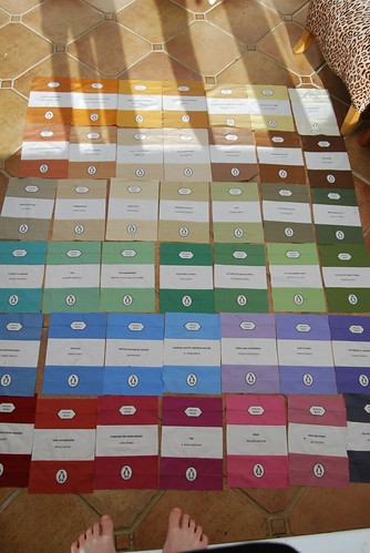
After much scrabbling round on the conservatory floor, we have finalised the layout of my sister's Penguin book quilt which you can see pictured below with my son's feet in the foreground. It will be sashed with 2" Kona snow strips, backed with Kona amethyst and a special surprise embellishment not yet revealed but I'm undecided about the binding. I'm thinking snow for simplicity, Mandy thinks black, to echo the writing on the books. Any thoughts or advice anyone?
It looks great! Why don't you use black and white stripe or polka dot to bring in the penguin :-)
ReplyDeleteWow, it's coming together so well...I love the colors!
ReplyDeleteI love this idea. Great quilt!
ReplyDeleteIts looking great. I like the idea of black, or something woody looking to be the bookcase.
ReplyDeleteLooks just wonderful with the colours changing across the rows, I'd go for narrow black white stripe like a barcode!
ReplyDeletei think you should go with the black...i always like to go dark because it feel like it frames the quilt so well. it looks great all laid out.
ReplyDeletethis is a thing of beauty!
ReplyDeletewow - you got on so fast with this! It's going to be stunning! I agree with Mandy - black.
ReplyDeleteI think black or as someone suggested a black & white stripe. White will make it disappear and float away, a dark colour will "contain" the piece together. Clear as mud?
ReplyDeleteHow original and beautiful! I think you should stick with solids for finishing, except maybe for the backing. Use a little black in the either the border or binding. Choose your favorite color from the book covers for the rest.
ReplyDeleteOh Lynne this is simply stunning - can yo imagine one done based on an author's covers - say a Dick Francis quilt or a Bronte quilt - the possibilities could be endless
ReplyDeleteBlack then I won't have to wash it.
ReplyDeleteps um what is the binding?
ReplyDelete1.You have a conservatory??????
ReplyDelete2.I'm not sure if a person who doesn't know what binding is should be trusted with a quilt.
3.Layout is fab
4.Amethyst for backing = genius
5.black for binding might look amazing, but wait until it's all pieced before you decide. The red second in on the bottom row could look pretty slick, too.
I'd say do a darker binding if you're going to sash it in the snow. Not necessarily black, but a black with white stripe like was suggested above...
ReplyDeleteOMG! Are you on drugs? Do you sleep ever? I am in total awe. I was chuffed with myself for making 5 small patchwork hearts! Black - or black and white - or maybe charcoal to give it a slightly aged look. Simply cannot wait for the finished result! xx
ReplyDeleteThis is amazing, it's going to look amazing when it's finished. I'm thinking black may be a bit heavy against all that wonderful colour - I like the charcoal idea.
ReplyDeleteIt is truly amazing. The work that has gone into it is incredible. Can't wait to see it finished.
ReplyDeleteWow this has come together so quickly. I vote for a darker binding.
ReplyDeleteThis is such a fab idea for a quilt! I definitely second (or third, fourth or fifth depending on how many have said the same thing before me) black to tie in with the writing on the books.
ReplyDeleteMy daughter, Mychaela, writes a blog for the huge fabric store, Michael Levine, in L.A.'s garment district. She recently wrote a blog on Kona Solids and I think your quilt is fantastic and would be a great project to showcase on their blogsite. If you are interested check them out. I am going to send a link to her of your Penguin quilt. (I am a Penguin Classic book reader, collector, lover. I would love that quilt. Your sister is lucky beyond the stars! Amanda
ReplyDelete