
I've removed the HopeValley from the wonky block I made and need to replace it with something else. These are the only fabrics I have which are in the same colour scheme as this month's blocks but I really don't know whether any of them work at all. I know you'll all think I'm a right numpty asking for advice on something as simple as this but please advise!

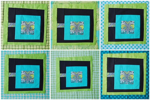
I like the top right one
ReplyDeleteI like the two far right hand ones (looks like grey with turquoise spots and petrol with turquoise spots - are they Flora and Fauna?). In fact, the more I look the more I love the bottom right one, it pops the green and the middle. NOT the middle two - far too samey.
ReplyDeleteI guess I gotta go with the bottom right one.
ReplyDeleteI am with Lynz. I love the bottom right one and I like the top right one. The other options are nice and each version would probably work but I really like how the aqua/blue compliments the blocks :)
ReplyDeleteI like the bottom right one. The word Numpty is so funny, it's making me laugh so much!!
ReplyDeletebottom right for me too!
ReplyDeleteIts between the top right and bottom right I much prefer the the top right though,its more harmonious. I think the bottom right one is a bit to dark, it makes the aqua coloured fabric stand out more but its personal preference really. x
ReplyDeleteI would go for the bottom right too, makes the green nice and zingy :)
ReplyDeletetop right one is my pick... very nice on the eye. 2nd pick would be bottom middle I think.
ReplyDeleteBottom right, imho, especially as I have some of that spot too! Love it! :) Which one makes YOUR heart sing?
ReplyDeleteI LOVE the bottom right... really makes the block SING... or should that be ZING?!!!
ReplyDeletedoh, please delete the link to my blog from the last post... it is wrong!!! Ta, Mairi
ReplyDeleteOk numpty ! , it's got to be the bottom right :)
ReplyDeleteBottom right for me - it stands out best.
ReplyDeleteTop right is the happy combo for me or any of the other turquoise options
ReplyDeleteI like the turquoise/aqua with the green -- the green-y colored fabrics in the middle are too similar to green you already have.
ReplyDeleteI'd go with either of the dots (TaDa dots?) top right or bottom right. I really like the contrast of the bottom right best, it's more dynamic since it's higher contrast, but the top works too.
Bottom right :-)
ReplyDeleteBottom right gives a lot of 'zing' to the block by pulling out its saturated colors--if you are going for vibrant, that's your winner!
ReplyDeleteI like the bottom right block best. It jumps out most and seems the most balanced in colour. What works for me when I get stuck, is to leave it be for a while and do something completely different. Most of the time I'll suddenly 'get it' again after that. Doesn't work every time though!
ReplyDeleteGood luck!
I personally like the one on the top right the best, but the lower right looks good too! Good luck!
ReplyDeletethey all look good, but the two on the far right are best.
ReplyDeletebottom right is my fav- it really makes the block POP! good luck!!
ReplyDeleteI like the dark blue polka dot. It gives contrast. Looking good.
ReplyDeleteLeila
Top left if you want something that blends more, bottom right if you want something that pops with more contrast. Beautiful coloring!
ReplyDeleteThe top right looks most comfortable with itself to me, it looks finished. Don't feel daft to ask, we're here to help - if we can, you now have loads of opinions to choose from! Looking forward to knowing which one you eventually go for.
ReplyDeleteI like the idea of adding blue back in....so #3 (top right) or #6 (bottom right) are my favs. I think either of those look fabulous!
ReplyDeleteoh my I posted without even looking at anyones comments...its funny it seems we all agree on the 2 that look the best. :)
ReplyDeleteBottom right, definitely!
ReplyDeleteI like top right best, bottom left second.
ReplyDeletemy favourite is the last one. i think it brings out the blue in the center and makes a good contrast with the green fabric that it will be next to.
ReplyDelete